Key Features
By implementing these key features, AskADoc enhances its user experience, making the platform more intuitive and patient-centered;
Streamlined registration with progress indicators and tips.
Prioritized shortcuts to consultations and key tools.
Unified access to notes, mood diary, and reminders.
Clear labels, icons, and accessible layouts.
Alerts for appointments, mood tracking, and notes
Users' Priority Mapping
The key features of AskADoc are designed to align with user priorities by simplifying access to core functionalities and enhancing engagement with secondary tools. Streamlined registration and prioritized shortcuts ensure users can quickly book consultations, while clear labels and an accessible layout make navigation intuitive for all users.
Unified dashboards and tooltips guide patients to effectively use features like the mood diary and notes, complemented by personalized alerts to keep them engaged and on track. Together, these improvements create a seamless, user-centered experience that addresses user pain points and fosters deeper adoption of the platform.
Defining the User Types
My approach involved researching user needs and pain points, then brainstorming and structuring solutions based on insights. After that, I developed prototypes to visualize the user experience, followed by testing with real users to refine and improve the design.
This process helped the final design by ensuring it was user-friendly, met patient and doctor expectations, and addressed key usability challenges.
Research
I started by gathering insights from both patients and doctors to understand their struggles with the platform. This involved:
User Interviews: I spoke with patients and doctors to understand their frustrations and needs. This led to the creation of a user persona that highlighted key pain points, providing a clearer understanding of the users the platform is being built for
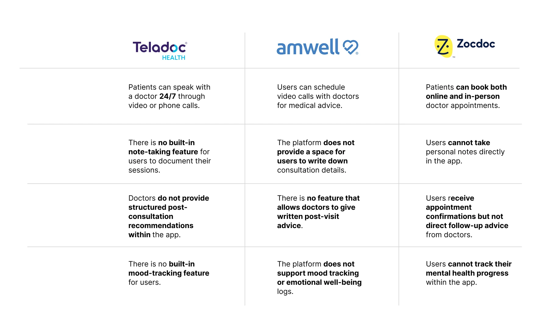
Competitor Analysis: Reviewing similar health platforms to find industry best practices. As shown below
Brainstorming/Ideation
With research findings in hand, I moved into ideation by:
Brainstorming solutions to improve the onboarding experience, consultation flow, and feedback system.
Mapping out user journeys to ensure patients and doctors had a seamless experience.

Above: Information Architecture (Showing layout of intended design))
Prioritizing features based on user pain points and business goals.
Prototyping
Next, I translated ideas into interactive designs by:
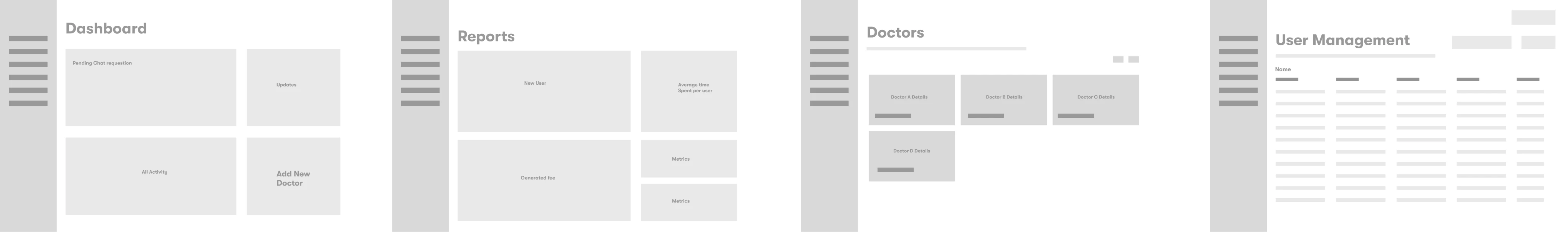
Creating wireframes to outline the structure and user flow.
Patients

Doctors
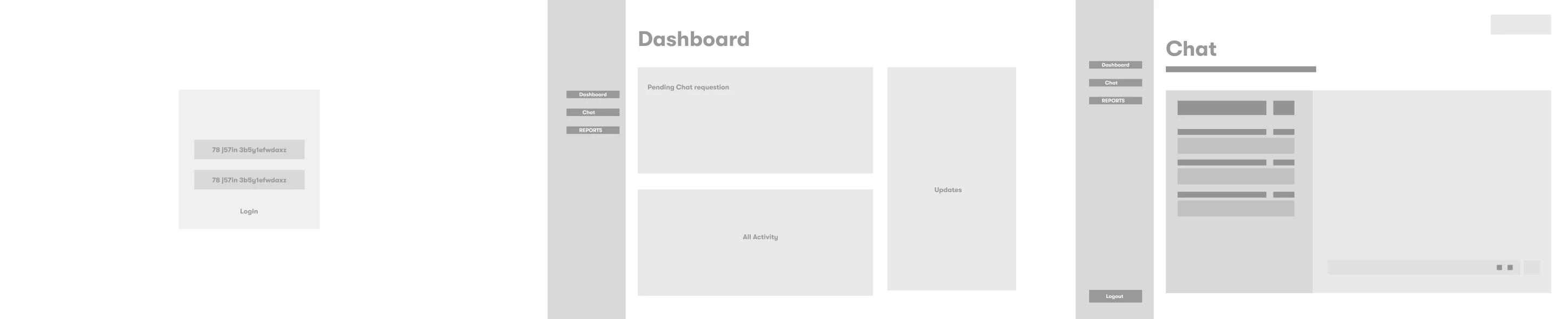
Administrator
Developing high-fidelity prototypes to test interactions and visuals.
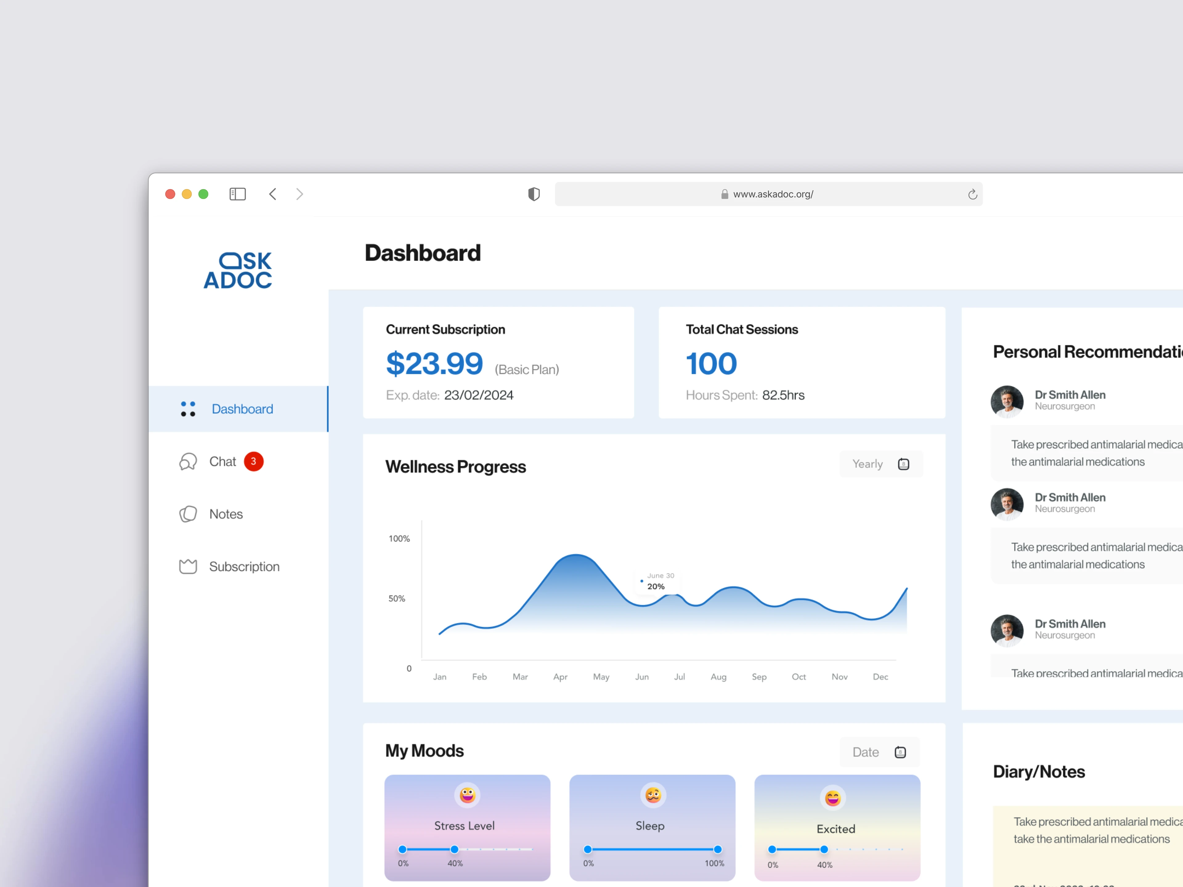


Refining the UI/UX to ensure accessibility and ease of use.
Testing
Before finalizing the design, I conducted usability tests by:
Observing how real users navigated the platform to identify any friction points.
Collecting feedback from patients and doctors on clarity and ease of use.
Iterating on the design based on findings to create a polished final product.
What was contributed to the Final Designs
This detailed process ensured that the final design was:
Here’s what was added to make AskADoc better:
Easy Sign-Up – Made the registration process simple so users could start quickly without confusion.
In-App Notes & Doctor Tips – Let users take notes and get health advice from doctors after consultations, even without a paid plan.
Mood Tracker – Added a way for users to track their feelings and share updates with doctors for better care.
Simple Navigation – Made the app easy to use so people could find what they need without stress.
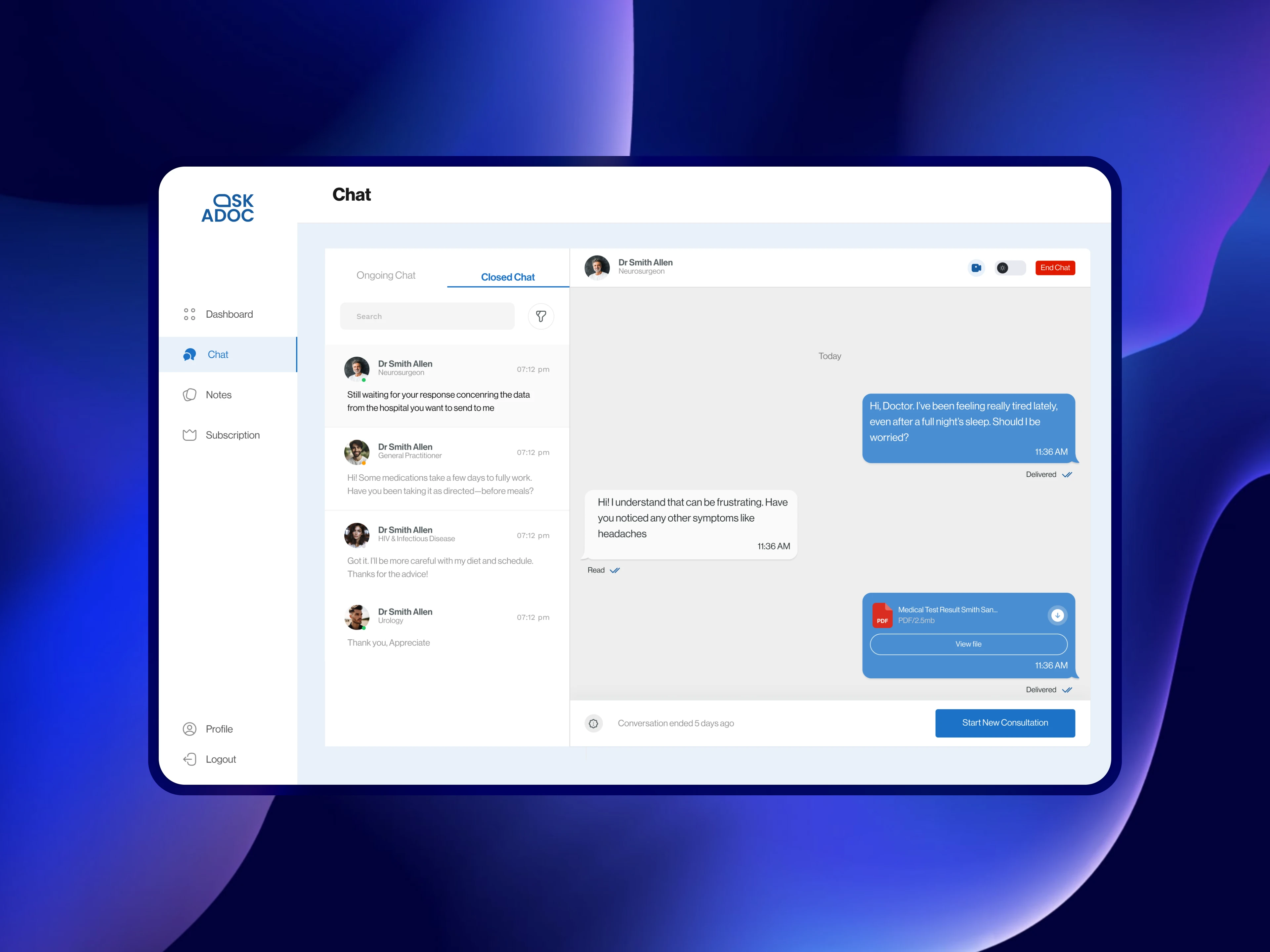
Better Doctor-Patient Chat – Improved how doctors give advice, making follow-ups smoother.
These changes made the app more useful, easy to use, and helpful for both patients and doctors.
Metrics used to define and measure success

We measured success by looking at how often people used the app and completed doctor consultation. This was important because if users kept coming back and using features like note-taking and mood tracking, it showed the app was helpful and easy to use.
We also checked how many users stayed on the app and if they were happy with it. If people kept returning and gave good feedback, it meant the app was meeting their needs and providing real value.
Lastly, we tracked how well key features were used and how fast doctors responded. If users found the features useful and doctors replied quickly, it meant the app was working well and building trust.
Outcome
After the first test release, we received a lot of feedback from both patients and doctors. There were several areas that needed improvement, especially in how users interacted with the platform.
We carefully reviewed and worked on all the suggested changes, making the experience smoother and more user-friendly. Patients found it easier to navigate, and doctors had a better way to provide feedback.
In the end, almost all issues were resolved, and the platform now meets the needs of both patients and doctors. It became a more reliable and efficient tool for medical consultations.
Challenges Encountered
One of the challenges I faced was ensuring a smooth process for users to schedule calls with doctors through the web app. Since the app relied on a third-party system for call scheduling, there were some technical hurdles in making the transition feel seamless. To solve this, I worked on refining the design and user flow, making sure the experience felt natural and easy to navigate despite the integration.
Another challenge was incorporating the daily mood diary for users who didn’t have an active subscription. It took about three design iterations to find a solution that worked—one that allowed users to log their moods while still making the information accessible to the doctors who needed it. Through testing and feedback, we finally landed on a design that balanced user accessibility with the platform’s subscription model.
Lastly, communication with the product owner and manager was sometimes tricky, as new feature requests kept coming in during development, which delayed the project. I learned the importance of setting clear expectations from the start and keeping stakeholders informed about timelines and progress. Moving forward, I’ll ensure better project structure by establishing clear milestones and making sure any changes are properly planned without affecting deadlines.